I was asked for a blog post on this topic. I also do birthdays!
HBase achieves balance by splitting regions when they reach a certain size, and by evenly distributing the number of regions among cluster machines. However, the balancer will not run in some cases (e.g. if there are regions stuck in transition), and balancing the number of regions alone may not help if region sizes are not mostly the same size. If a region server is hosting more regions than the others, requests to that server experience higher latency, and batch (map-reduce) jobs take longer to complete due to parallel skew.
At $work we graph these data hourly, and here’s how we do it.
First, we run the following JRuby script from cron. [Note: I’ve been advised (thanks ntelford!) that HServerInfo is gone in newer releases and you now need to get HServerLoad via ClusterStatus.getLoad(server_name).]
# This ruby script dumps a text file of region sizes and the servers
# they are on, for determining balance/split effectiveness.
#
# Usage: hbase org.jruby.Main region_hist.rb
#
include Java
import org.apache.hadoop.hbase.ClusterStatus
import org.apache.hadoop.hbase.HBaseConfiguration
import org.apache.hadoop.hbase.HServerInfo
import org.apache.hadoop.hbase.HServerLoad
import org.apache.hadoop.hbase.HTableDescriptor
import org.apache.hadoop.hbase.client.HBaseAdmin

def main()
    conf = HBaseConfiguration.new()
    client = HBaseAdmin.new(conf)

    status = client.clusterStatus
    status.serverInfo.each do |server|
        server_name = server.serverName
        printed_server = false

        load = server.load
        rload = load.regionsLoad
        rload.each do |region|
            region_name = region.nameAsString
            size = region.storefileSizeMB
            puts "#{server_name}t#{region_name}t#{size}"
            printed_server = true
        end
        if !printed_server then
            puts "#{server_name}tNONEt0"
        end
    end
end

main()
The script generates a flat file with server name, region name, and region
store file size fields:
c1.example.com,60020,1333483861849  .META.,,1   2
c2.example.com,60020,1333484982245  edges,175192748,176293002,1331824785017.fc03e947e571dfbcf65aa16dfd073804    1723
...
We then process this through a pile of Perl (I’ll spare the details) to generate several other data files. First, there’s a flat file with a sum of region sizes and region count per table:
server  -ROOT-  -ROOT-  .META.  .META.  edges   edges   ids ids verts   verts   userdata    userdata    types   types   stats   stats   topics  topics  topics_meta topics_meta maps    maps
c1  0   0   0   0   51041   41  0   0   27198   12  0   0   0   0   585 2   0   0   0   0   0   0
c2  0   0   0   0   49260   40  3501    1   20090   10  0   0   0   0   772 3   0   0   0   0   0   0
...
Next, for each table, we generate a file showing the total size of each region:
1   230
2   510
3   1200
The first column is just a line numbering. The region sizes are sorted to make the final chart easier to read.
From there we use gnuplot to generate a histogram of the regions by numbers and by size, and then a per-table chart of the region size distribution. The gnuplot file looks like this:
set terminal png
set key invert reverse Left outside
set key autotitle columnheader
set boxwidth 0.75
set xtics nomirror rotate by -45 font ",8"
set key noenhanced
set yrange[0:*]
set style histogram rowstacked gap 1 title offset 2, 0.25
set style data histogram
set style fill solid border -1
set output 'hbase-fig1.png'
plot 'load.dat' using 3:xtic(1), for [i=2:11] '' using 2*i+1

set output 'hbase-fig2.png'
plot 'load.dat' using 2:xtic(1), for [i=2:11] '' using 2*i

set ylabel "Store Size (MB)"
set xlabel "Store"
unset xtics
set output 'hbase-fig3.png'
plot 'splits_edges.dat' using 2:xtic(1) title 'edges'
Here’s the end result (I changed the server and table names but this is otherwise real data):

In the above figure, we can see there’s a good balance of the number of regions across the region servers. We can also easily see which servers are hosting which regions, such as the important, but small, -ROOT- and .META. tables. So far, so good.

In this image, we see that the total size is not very well balanced: server c13 has a lot more data than the others. Taken together, these graphs indicate that our regions are not all the same size. The next image shows this more dramatically.
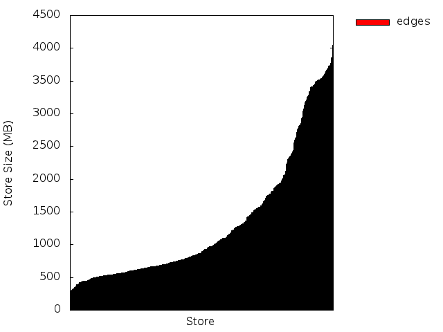
Here we see that around 60% of our regions for this table are smaller than 1 Gig, and the remaining 40% are split between 1-2G and 2-4G sizes. We would rather see a baseline at 2G (half the max region size), and the midpoint around 3G assuming evenly distributed splits. In our case, we had increased the region size of our largest table late in the game, so there are a ton of small regions here that we should try to merge.
Seeing the regions at a glance has been a useful tool. In one case, we got a factor of 8 speedup in a map-reduce job by re-splitting and manually moving regions to ensure that all the regions were evenly distributed across the cluster — the difference between running a job once a week vs. running it once a day.