
Happy Canadian Thanksgiving! Now it’s time to do the dishes.
Happy Canadian Thanksgiving! Now it’s time to do the dishes.
Some progress has been made on my guitar chip amp. Readers may remember that at the time of my last post, I had tinkered with KiCad and created the basic layout for my PCB. Since then, I finalized the design and had it fabbed through the great OSH Park batch prototyping service. This is a great deal: it wound up being about $10 a board (you get three at $5/sq. in) and the boards are of excellent quality. It took about 3 weeks from time of design submission for the finished boards to arrive in Canada from the States.
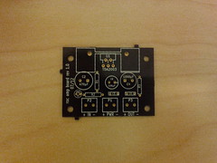
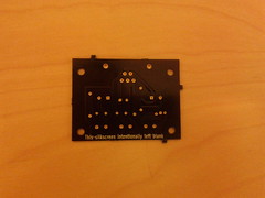
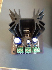
Above are the top and bottom of one the unpopulated boards. The solder mask is the OSH Park signature purple, and the through-holes are gold-plated. The bottom side silkscreen says “This silkscreen intentionally left blank” — a last minute addition because the service’s design checks fail if any layers are missing. I should get more creative with that next time.
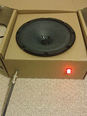
Although I do plan to someday build a wooden speaker cabinet to house everything, for now I just shoved all the electronics in the box that the speaker came in, as it happens to be the right size. Plug the instrument cable in the front, flip on the illuminated switch, and one is ready to rock.
I had all the parts waiting for the boards, so when they arrived I quickly populated one and hooked it up, plugged in my Les Paul and strummed an E chord. The resulting sound was something short of musical: loud, ringing, distorted noises were heard instead of the clear tones of my prototype. I feared that my board design was flawed, and without a scope handy, it would be tough to track down. But on the plus side, I knew that I was about to learn something.
I spent an hour or so following all of the traces on the board and comparing them to the schematic, making sure the caps were all connected the right way around and so forth. I also compared the finished board to my protoboard, which happened to work fine. Everything was the same, except where I had used two 1 ohm resistors in series to invent a 2 ohm resistor (the datasheet called for a 2.2 which I didn’t have at prototyping time).
Then I looked at said resistors a little more closely. On the outside edge, I could just make out a faint yellow band where I previously thought there was none. And that brown band was just the tiniest bit in the purple spectrum. Oops! My 1 ohm resistors were actually 47 ohms, making the gain of my prototype a measly three instead of the 101 I thought it was. It turns out that a gain of 101 is way too high without a volume knob. Also, one of the 47-ohm resistors was in a stabilizing RC circuit, likely causing the ringing oscillations I had heard in my PCB version.
I fixed the RC circuit when building board number two, but stuck with the 2.2 ohm resistor and accompanying large gain. I might use this version if I decide to put a volume knob in front of the amplifier, but I do find it’s a little too noisy overall for my tastes. I thus went back to board number one, desoldered the 47 ohm and 2.2 ohm resistors and replaced them with 1 ohm and 22 ohm resistors respectively, lowering the gain of that board to a modest eleven.
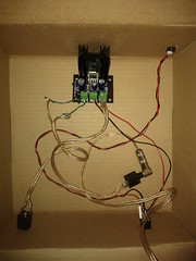
Pictured above are the before and after of prototype and PCB versions. There are certainly a few things I would change if I ever make another revision of the PCB. For one, the annular rings on the heat sink and connector footprints were too small, so soldering them was difficult with so little of the pad exposed. I might also do away with or reduce the size of the ground plane; even with the thermal reliefs, soldering and desoldering the ground connections was no easy task. But on the whole, making the PCB was an interesting experience and I look forward to having another excuse to do so again.
I’ll put the design files up on github one of these days.
When we moved to Canada, I sold any guitar gear that wouldn’t fit in a backpack. This has left me without the ability to plug in my electric guitar for the last ten months, a situation that must be rectified (ha, ha). I just need a small practice amp, and those can be found on an IC these days. One needs only to add a little soldering, attach a speaker, repeat as necessary for whatever mistakes one makes, and ta-da: a small custom amp that one could have bought mass-produced from China for 1/50th of the price of building one’s own. But of course there is value in the making, or so we tell ourselves.
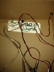
Anyway, I’ve built my circuit (more or less the same one as on the op-amp’s datasheet) on a breadboard and it sounds fine except for the complete lack of shielding. Since it’s now possible to get one-off PCBs without spending a fortune, and using a real board is more fun than protoboards, let’s do that!
Back in the dark ages, I used to work on a PCB software that sold for $30k/license (I thought that was ridiculous then too). While I seem to have stuffed some arcane knowledge about keepouts and autorouters somewhere in the back of my brain, most of the PCB black magic did not rub off on me. After a 15-year hiatus from that domain, I can firmly label myself “PCB novice.”
Eagle Light (free as in beer) is the choice of many a hobbyist. I have poked at Eagle before, but never liked it enough to do anything substantive. These days, getting it to run at all means finding library versions that aren’t used in any current Linux distribution, building them, doing some LD_LIBRARY hacks, setting up a 32-bit runtime, and so on. Yes, I also did that this weekend. Eagle has a nice big standard library, but I feel learning it at all is a bit of a dead end when there are usable, truly free alternatives. And KiCad looks like it just may fit the bill. I apt-get installed it and was off to the races.
Overall, KiCad is a nice piece of FOSS software that can easily do whatever one would do in Eagle. Unfortunately, it still reminds me of what I hate about PCB software in general. I find designing a PCB to already be extremely fiddly and unfun; as a non-expert, I just want to build a schematic and then place and route things with sensible defaults. Instead, what I wound up doing was learning to use the symbol editor, and the module editor, gathering various facts about drill and pad sizes, and picking up KiCad’s various quirks such as how you have to constantly reload newly created libraries, and how the UI frequently makes no sense. Of course, UIs never make any sense in EDA tools, so you sometimes just have to go with it. Doing librarian work is ultra-boring, especially for tiny boards like this.
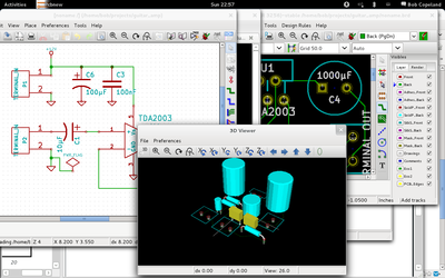
Still, in the course of a few hours, I built the basic schematic (including adding three new symbols), passed ERCs, created three missing footprints, and did an initial routing of the board. Not too bad.
In the last decade component libraries have grown 3-D models, which is kind of neat. On the one hand, it’s not terribly useful since the canned components are unlikely to closely match reality, and editing 3-D models of components is even less interesting to me than editing their footprint. But, it does make for decent screenshots like the one above.
When I did my previous work with mac0211_hwsim, I wrote the channel model in matlab and pre-generated a huge lookup table of frame error rates for different SNR values and transmission rates so that the simulator didn’t have to do any thinking for each packet. Obviously that’s a bit limiting and not in any way upstreamable in something like wmediumd.
So, I sat down today and rewrote it in C to see how bad the computation is. Actually, it’s not awful: I didn’t carefully benchmark it, but it sits at around 30 µsec per calculation, and there is probably a good deal of low hanging fruit such as making factorial() cache its computations, or fitting the output curves with cubics. I stuck the initial code on a wmediumd topic branch over here.

I verified the output matched my matlab code and charted it as above. Careful observers will note the 9 mbps rate is always worse than 12 mbps; this was a finding of D. Qiao and S. Choi in “Goodput enhancement of IEEE 802.11a wireless LAN via link adaptation,†in Proc. IEEE ICC01, from which most of my math was appropriated.
A Study of 802.11 Bitrate Selection in Linux (January 2010).
I didn’t think too much of this paper when I wrote it as a term project in grad school. As an academic paper, it doesn’t really present anything novel. The equations underlying my wireless medium simulation, for example, are wholesale lifted from sources. In the few academic papers still being written on the subject, rate controllers that do not specifically look at collisions are old news (even though Minstrel tends to get loss differentiation implicitly through the magic of probability). Even at the time, looking at non-QoS 802.11 DCF and only 802.11a rates made the whole exercise a bit dated, and the world has definitely moved on in the intervening years. The paper did, however, find a few flaws (or perhaps over-exuberances) in Minstrel’s multi-rate-retry mechanism that may still be unfixed upstream, and many more flaws in PID (one I fixed upstream, but it is still not usable). I wanted to go back and redo the physical experiments before submitting patches to Minstrel, but life intervened.
However, I’ve recently been talking to the good folks at cozybit, who picked up where I left off by creating wmediumd (which does more or less the same thing but in a more polished fashion). There were still some things in my version that wmediumd lacks today, so I’m posting the paper to give it a slightly wider audience. I’d be interested to hear of any glaring flaws in the model or approach. Given time, I’d like to bring those missing features (namely, signal-level-based loss, and optional transmission time simulation) to wmediumd and repeat the experiments there.
As for the fixes to Minstrel, the basic theme is reducing the number of retries to avoid backoff, since at some point it is better to drop packets and send the next batch at a lower rate rather than retrying for tens of ms. This patch (untested) addresses one of the two points I mentioned in the paper. The other fix, to compute the backoff time per-slot, was an über-kludge in my experiments; I’ll have to see if there’s an upstreamable way to do that. Pretty much everyone (even for pre-11n devices) is using Minstrel-HT now, so it would be worthwhile to refresh and see if the issues were carried over there as well.
Continuing with the charting theme, I wrote a quick python script yesterday to generate timing diagrams from pcap files while learning matplotlib. It’s just at the proof-of-concept stage but could be useful to debug things like power-saving in wireless. Surely something like this exists somewhere already, right? I couldn’t find it in the Google.

Along the way I had to write a python radiotap parser; that might actually be useful to others so I’ll try to put it on github at some point.
I was asked for a blog post on this topic. I also do birthdays!
HBase achieves balance by splitting regions when they reach a certain size, and by evenly distributing the number of regions among cluster machines. However, the balancer will not run in some cases (e.g. if there are regions stuck in transition), and balancing the number of regions alone may not help if region sizes are not mostly the same size. If a region server is hosting more regions than the others, requests to that server experience higher latency, and batch (map-reduce) jobs take longer to complete due to parallel skew.
At $work we graph these data hourly, and here’s how we do it.
First, we run the following JRuby script from cron. [Note: I’ve been advised (thanks ntelford!) that HServerInfo is gone in newer releases and you now need to get HServerLoad via ClusterStatus.getLoad(server_name).]
# This ruby script dumps a text file of region sizes and the servers
# they are on, for determining balance/split effectiveness.
#
# Usage: hbase org.jruby.Main region_hist.rb
#
include Java
import org.apache.hadoop.hbase.ClusterStatus
import org.apache.hadoop.hbase.HBaseConfiguration
import org.apache.hadoop.hbase.HServerInfo
import org.apache.hadoop.hbase.HServerLoad
import org.apache.hadoop.hbase.HTableDescriptor
import org.apache.hadoop.hbase.client.HBaseAdmin

def main()
    conf = HBaseConfiguration.new()
    client = HBaseAdmin.new(conf)

    status = client.clusterStatus
    status.serverInfo.each do |server|
        server_name = server.serverName
        printed_server = false

        load = server.load
        rload = load.regionsLoad
        rload.each do |region|
            region_name = region.nameAsString
            size = region.storefileSizeMB
            puts "#{server_name}t#{region_name}t#{size}"
            printed_server = true
        end
        if !printed_server then
            puts "#{server_name}tNONEt0"
        end
    end
end

main()
The script generates a flat file with server name, region name, and region
store file size fields:
c1.example.com,60020,1333483861849  .META.,,1   2
c2.example.com,60020,1333484982245  edges,175192748,176293002,1331824785017.fc03e947e571dfbcf65aa16dfd073804    1723
...
We then process this through a pile of Perl (I’ll spare the details) to generate several other data files. First, there’s a flat file with a sum of region sizes and region count per table:
server  -ROOT-  -ROOT-  .META.  .META.  edges   edges   ids ids verts   verts   userdata    userdata    types   types   stats   stats   topics  topics  topics_meta topics_meta maps    maps
c1  0   0   0   0   51041   41  0   0   27198   12  0   0   0   0   585 2   0   0   0   0   0   0
c2  0   0   0   0   49260   40  3501    1   20090   10  0   0   0   0   772 3   0   0   0   0   0   0
...
Next, for each table, we generate a file showing the total size of each region:
1   230
2   510
3   1200
The first column is just a line numbering. The region sizes are sorted to make the final chart easier to read.
From there we use gnuplot to generate a histogram of the regions by numbers and by size, and then a per-table chart of the region size distribution. The gnuplot file looks like this:
set terminal png
set key invert reverse Left outside
set key autotitle columnheader
set boxwidth 0.75
set xtics nomirror rotate by -45 font ",8"
set key noenhanced
set yrange[0:*]
set style histogram rowstacked gap 1 title offset 2, 0.25
set style data histogram
set style fill solid border -1
set output 'hbase-fig1.png'
plot 'load.dat' using 3:xtic(1), for [i=2:11] '' using 2*i+1

set output 'hbase-fig2.png'
plot 'load.dat' using 2:xtic(1), for [i=2:11] '' using 2*i

set ylabel "Store Size (MB)"
set xlabel "Store"
unset xtics
set output 'hbase-fig3.png'
plot 'splits_edges.dat' using 2:xtic(1) title 'edges'
Here’s the end result (I changed the server and table names but this is otherwise real data):

In the above figure, we can see there’s a good balance of the number of regions across the region servers. We can also easily see which servers are hosting which regions, such as the important, but small, -ROOT- and .META. tables. So far, so good.

In this image, we see that the total size is not very well balanced: server c13 has a lot more data than the others. Taken together, these graphs indicate that our regions are not all the same size. The next image shows this more dramatically.
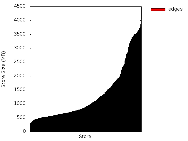
Here we see that around 60% of our regions for this table are smaller than 1 Gig, and the remaining 40% are split between 1-2G and 2-4G sizes. We would rather see a baseline at 2G (half the max region size), and the midpoint around 3G assuming evenly distributed splits. In our case, we had increased the region size of our largest table late in the game, so there are a ton of small regions here that we should try to merge.
Seeing the regions at a glance has been a useful tool. In one case, we got a factor of 8 speedup in a map-reduce job by re-splitting and manually moving regions to ensure that all the regions were evenly distributed across the cluster — the difference between running a job once a week vs. running it once a day.
I had a Hadoop map-reduce job that kept timing out, which led to this interesting discovery:
$ time ./json-parser-test.py

real	0m0.205s
user	0m0.152s
sys	0m0.032s

$ time ./json-parser-test-no-speedups.py

real	0m2.069s
user	0m2.044s
sys	0m0.024s

$ time jython ./json-parser-test-no-speedups.py

real	79m59.785s
user	80m23.709s
sys	0m14.441s
Moral: use Java-based JSON libraries if you have to use Jython and JSON. Also, Java sucks.
I’ve been doing a fair amount of HBase work lately at $work, not least of which is pybase, a python module that encapsulates Thrift and puts it under an API that looks more or less like the Cassandra wrapper pycassa (which we also use).
When running an HBase cluster, one must very quickly learn the stack from top to bottom and be ready to fix the metadata when catastrophe strikes. Most of the necessary information about HBase regions is stored in the .META. table; unfortunately some of the values therein are serialized HBase Writables. One usually uses JRuby and directly loads Java classes to deal with the deserialization, but we’re a Python shop and doing it all over thrift would be ideal.
Thus, here’s a quick module to parse out HRegionInfo along with a few generic helpers for Writables. I haven’t decided yet whether this kind of thing belongs in pybase.
I’m curious whether there is an idiomatic way to do advancing pointer type operations in python without returning an index everywhere. Perhaps converting an array to a file-like object?
#!/usr/bin/python
import struct

def vint_size(byte):
    if byte >= -112:
        return 1

    if byte <= -120:
        return -119 - byte

    return -111 - byte

def vint_neg(byte):
    return byte < -120 or -112 <= byte < 0

def read_byte(data, ofs):
    return (ord(data[ofs]), ofs + 1)

def read_long(data, ofs):
    val = struct.unpack_from(">q", data, offset=ofs)[0]
    return (val, ofs + 8)

def read_vint(data, ofs):
    firstbyte, ofs = read_byte(data, ofs)

    sz = vint_size(firstbyte)
    if sz == 1:
        return (firstbyte, ofs)

    for i in xrange(0, sz):
        (nextb, ofs) = read_byte(data, ofs)
        val = (val << 8) | nextb

    if vint_neg(firstbyte):
        val = ~val

    return (val, ofs)

def read_bool(data, ofs):
    byte, ofs = read_byte(data, ofs)
    return (byte != 0, ofs)

def read_array(data, ofs):
    sz, ofs = read_vint(data, ofs)
    val = data[ofs:ofs+sz]
    ofs += sz
    return (val, ofs)

def parse_regioninfo(data, ofs):
    end_key, ofs = read_array(data, ofs)
    offline, ofs = read_bool(data, ofs)
    region_id, ofs = read_long(data, ofs)
    region_name, ofs = read_array(data, ofs)
    split, ofs = read_bool(data, ofs)
    start_key, ofs = read_array(data, ofs)
    # tabledesc: not about to parse this
    # hashcode: int

    result = {
        'end_key' : end_key,
        'offline' : offline,
        'region_id' : region_id,
        'region_name' : region_name,
        'split' : split,
        'start_key' : start_key,
    }
    return result
I’ve changed hosting providers this week, and my new host provisions IPv6 addresses. Thus, I’ve published an AAAA record today. The world’s most boring website will survive the IPv4 apocalypse.
WordPress also gained an update, but the importer forgot all settings, tags and categories. I’ll go back and fix those someday.
Update: someday is now. I’ve also picked last year’s theme and otherwise modernized the place. Resume party. Also, the header image is a pic I snapped of a piece of Eniac. It’s partially full of tubes.