I messed around with “speccy” a bit today to see what I could do with it to make it look slightly nicer. It really needed a grid so one can more easily see the frequencies and power levels. So now it looks like this:
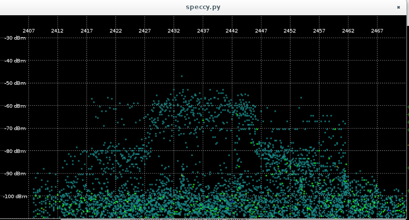
(This is with iperf running on channel 6 to a nearby AP).
I have in mind a couple of other visualizations. An obvious one is to show the overall max or average power level rather than a scatter plot. This would be a cleaner display, although there could be co-channel interference sources you wouldn’t see that way. Here’s a first cut at that:
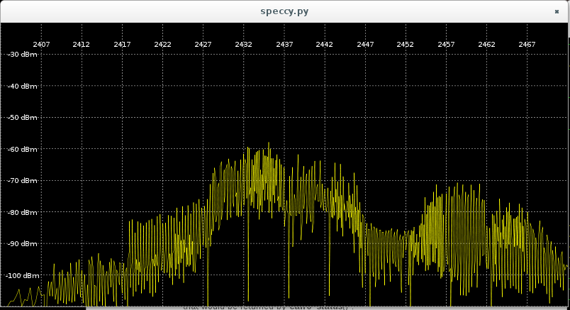
I am doing some averaging for multiple (~8) samples with the same subcarrier frequency, but clearly more smoothing is needed. Also I notice that I occasionally get some artifact where all the subcarriers have the exact same power level. Not sure what that is, but it wants filtering.
Another interesting visualization would be a scrolling chart of frequency vs time, with power level indicated by pixel intensity. Then you could get an idea of historical changes in the medium. (Oh hey, the neighbors are watching Netflix now.)
The code is still an ugly pile of hacks, which it will probably continue to be until I decide just what kind of processing needs doing on the raw samples. Sorry for that.